Overview
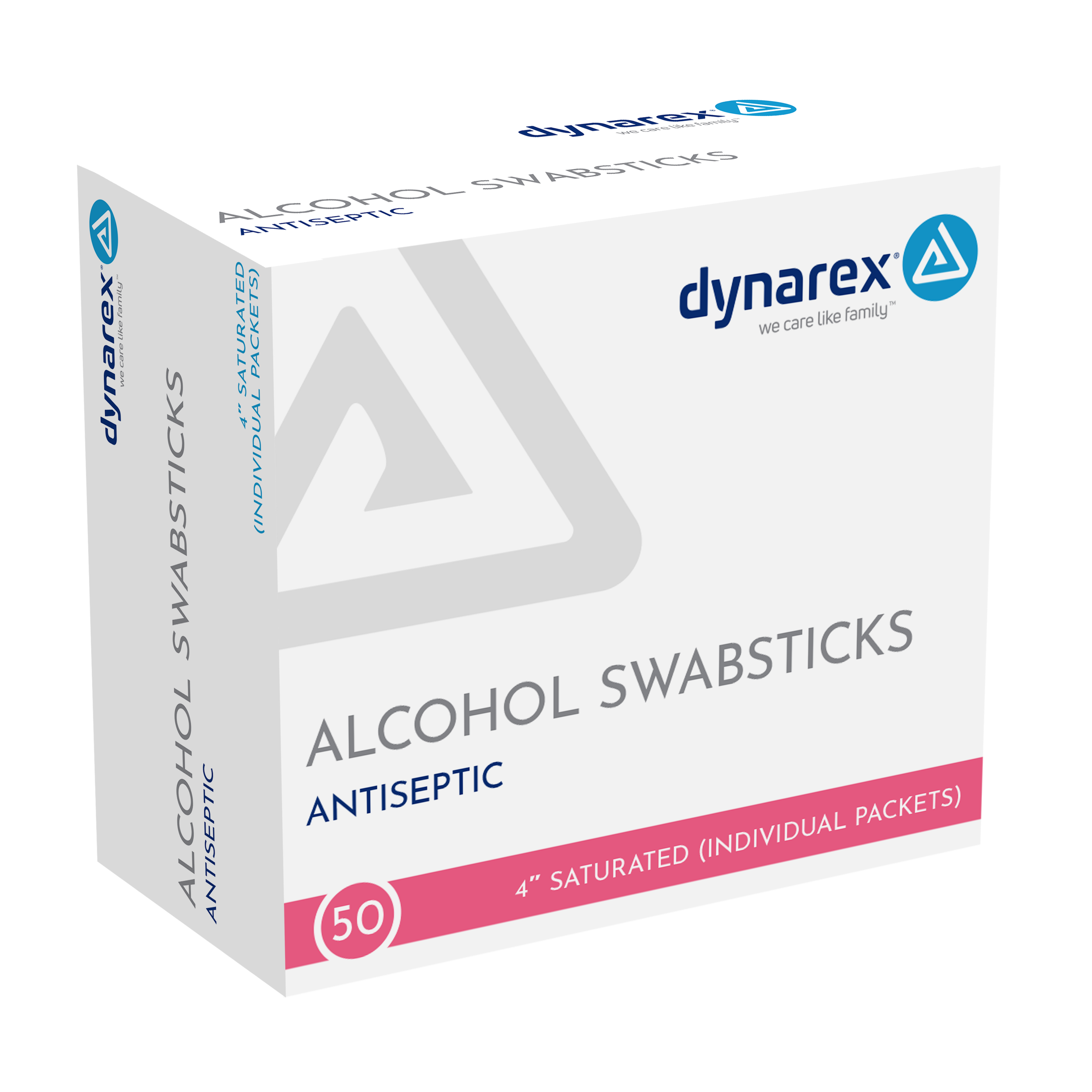
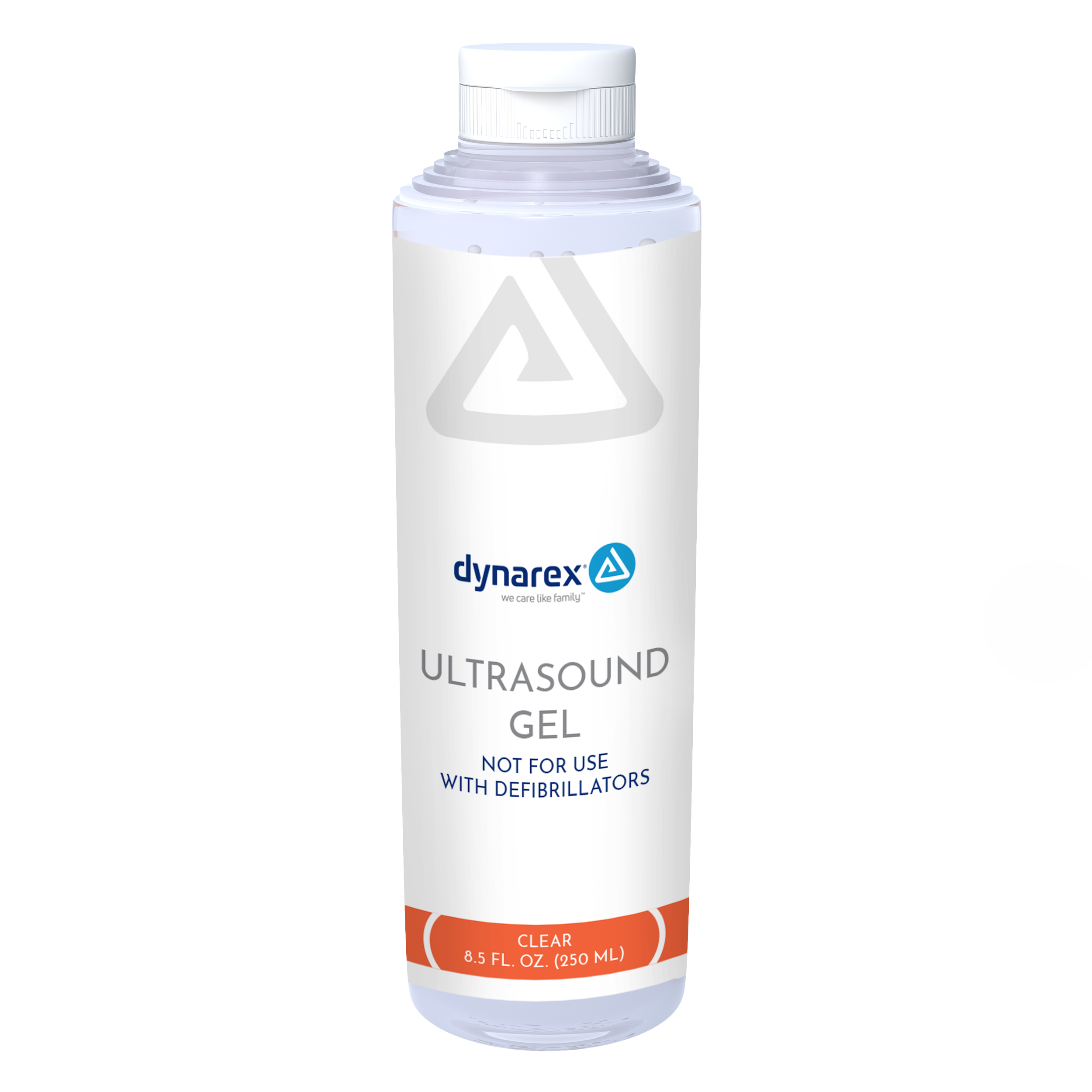
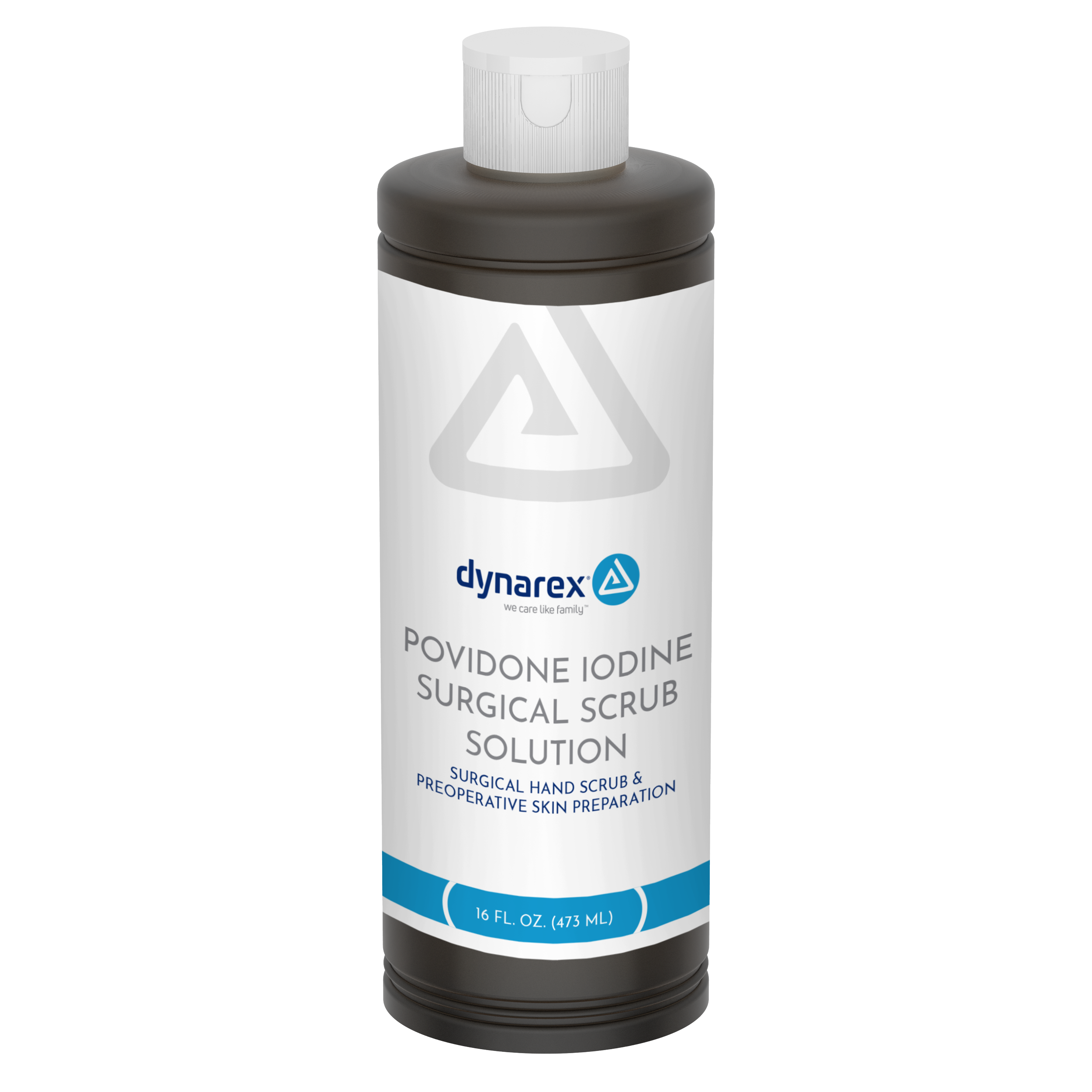
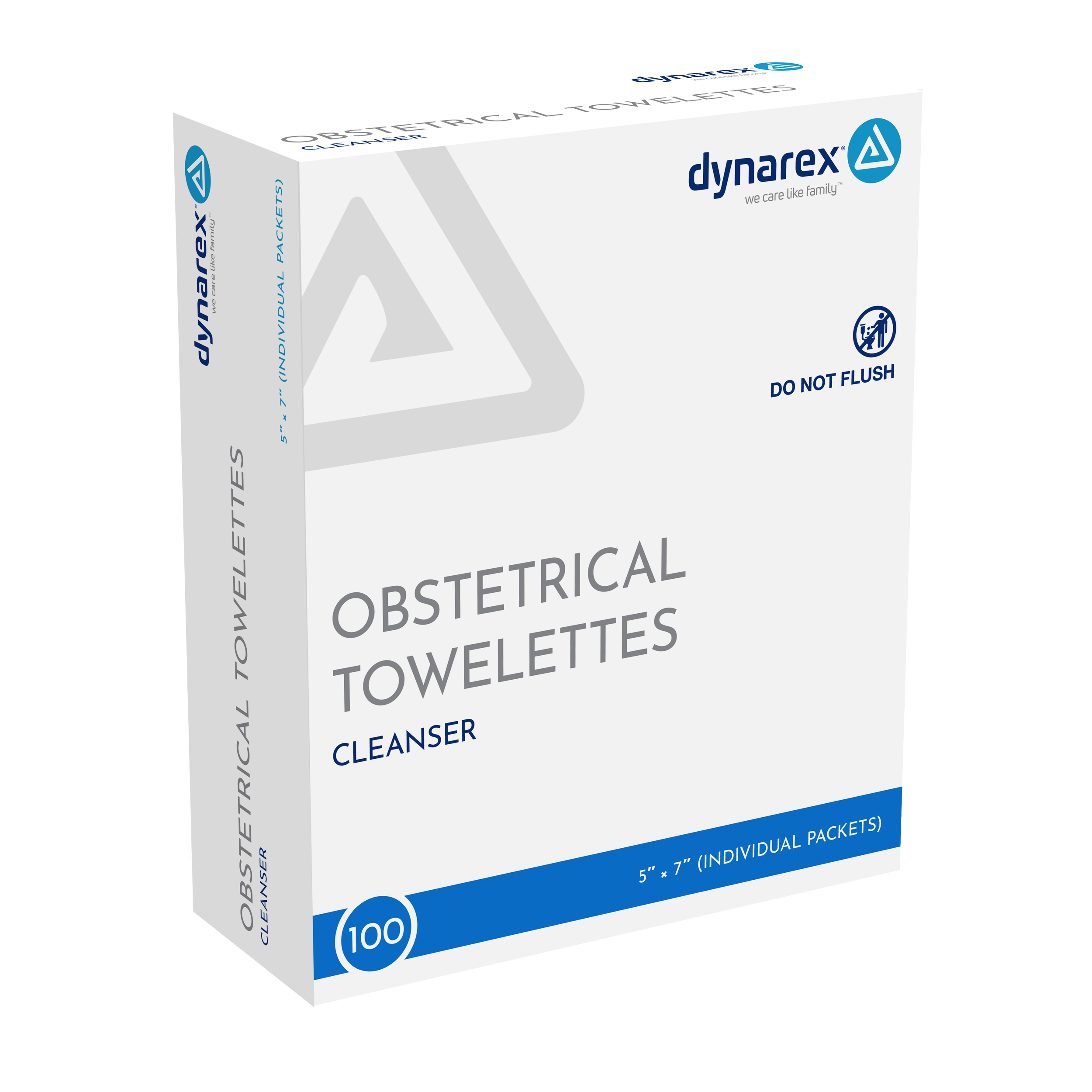
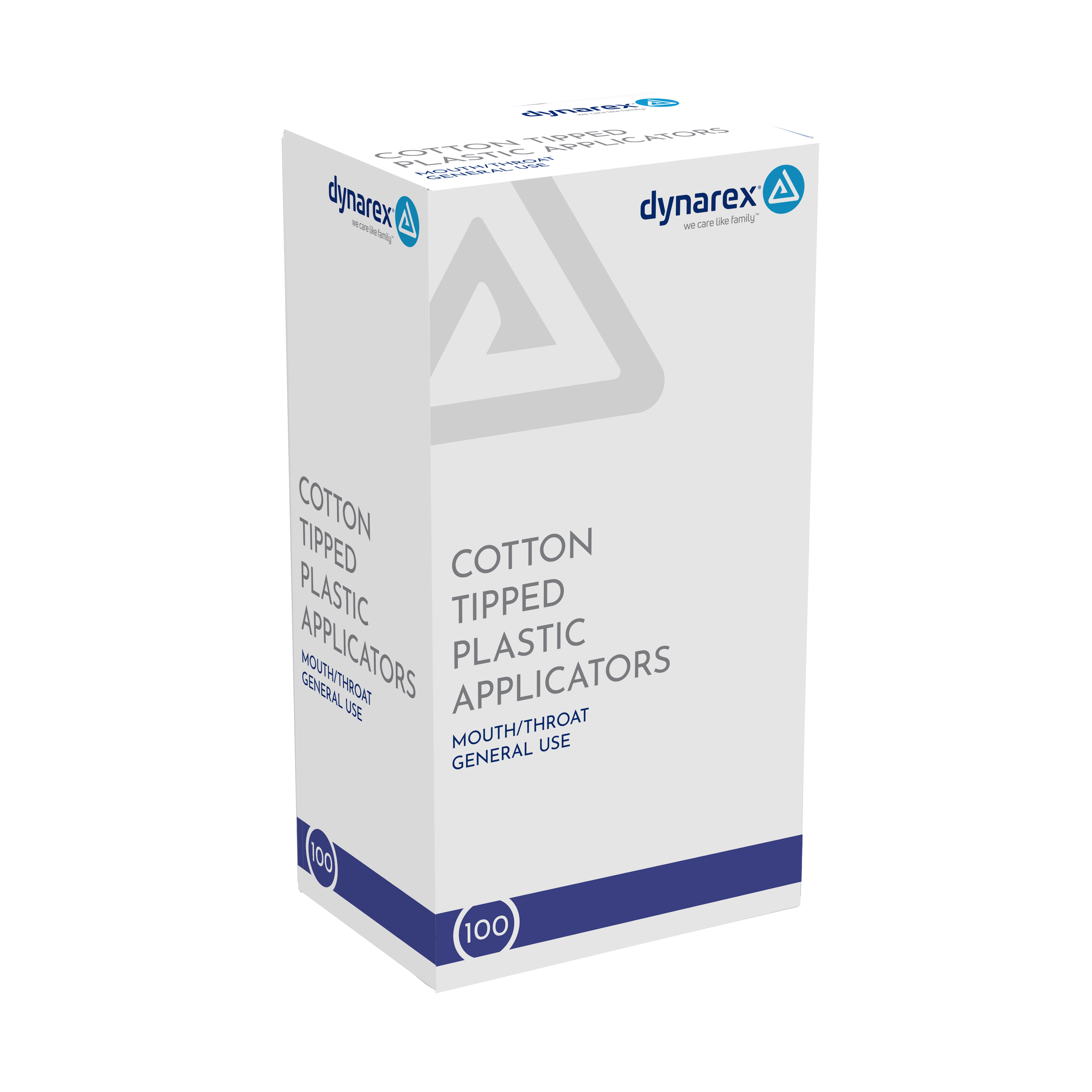
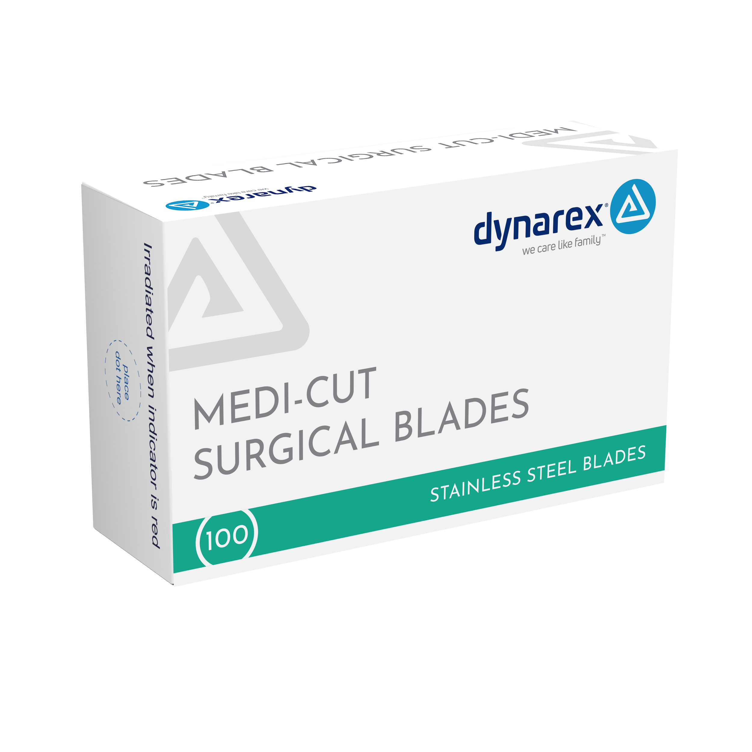
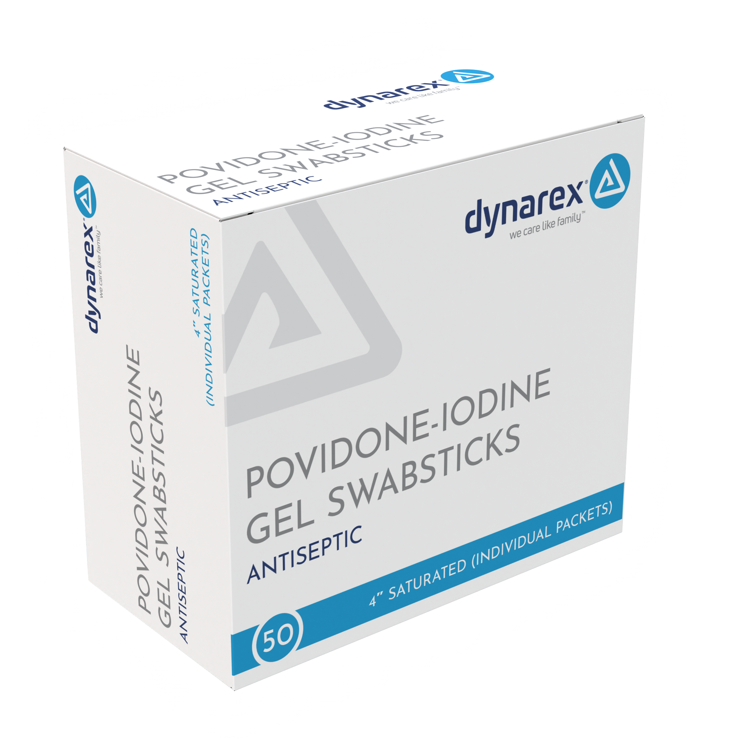
Dynarex serves professional healthcare environments including hospitals, physician offices, nursing and long-term care facilities, EMS providers, and distributors. With hundreds of products across very different categories, the packaging needed to feel like one brand while still making each product easy to identify.
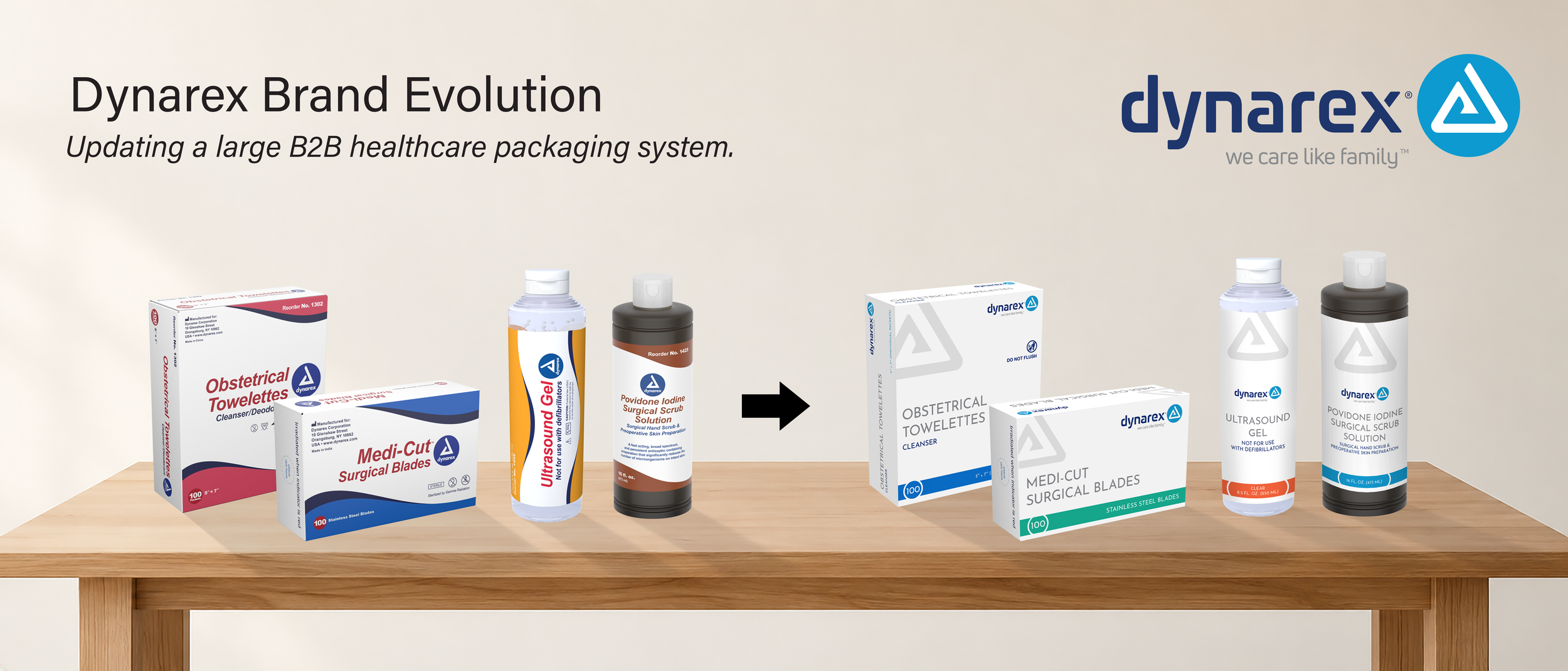
The original packaging was functional, but the overall look had become dated and visually busy. Heavy waves, gradients, competing elements, and differences from one product family to another made the brand feel less consistent than it could have.
Because the line remained focused on B2B healthcare, the priority was clarity, consistency, and efficient product identification across the portfolio. The redesign focused on creating a cleaner system, improving hierarchy, and building a more consistent Dynarex brand across hundreds of products.
My Role
I was managing the Graphics team, but my role also included a large amount of project management.
I coordinated timelines, kept communication moving between departments, reviewed work with the designers, and helped manage packaging updates as they moved through the approval process.
I worked closely with the COO, who acted as creative director. I brought my own design recommendations into the conversations and gave input on hierarchy, consistency, color, and how the system could work across very different package formats. The COO had final approval on the creative direction.
I also worked closely with Regulatory throughout the process. Because these were healthcare products, the packaging had to meet regulatory and product-information requirements. Design decisions had to work around required content while still keeping the packaging clear and easy to navigate.
The Challenge
This was not a redesign of one product. It was a system that had to work across thousands of SKUs.
The previous packaging relied heavily on waves, gradients, and decorative elements. Information could compete for attention, and the visual treatment was not always consistent from one category to another.
We needed something cleaner and more modern.
The updated system had to work across cartons, bottles, labels, pouches, packets, and other formats while keeping the Dynarex brand recognizable throughout the portfolio.
The New Direction
We simplified the overall structure and put more emphasis on the information people actually needed to find.
Product names became more prominent, supporting information was organized more clearly, and the layouts used more white space. Logo placement, typography, spacing, and other repeated elements became more consistent across the line.
Color also had a clearer purpose. Instead of being used mainly as decoration, it helped separate categories and SKUs while the overall structure kept everything connected to Dynarex.
The goal was to create a system that could be repeated across very different products without forcing every package into exactly the same layout.
Working Across Departments
A project this large depended on much more than the Graphics team.
I kept projects moving between Graphics, Regulatory, Product Development, Marketing, Data, and the other departments involved in packaging development. Some changes were visual, while others came from regulatory updates, product changes, manufacturing requirements, or information that needed to be corrected before production.
Part of my role was making sure the right people were involved, tracking where projects stood, and helping resolve issues before they affected final production.
Sensi-Wrap: Moving One Product Family into B2C
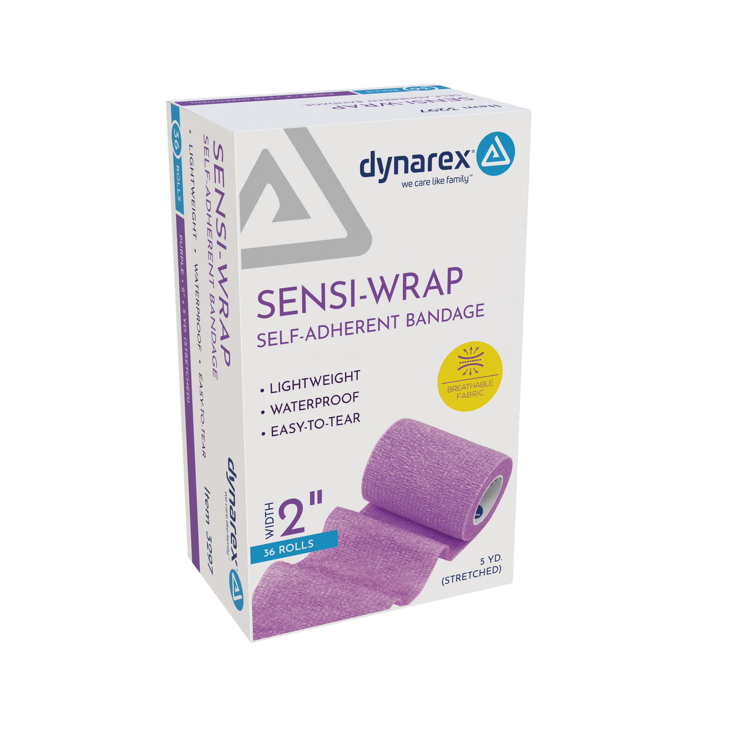
Sensi-Wrap was the exception to the broader B2B approach.
This product family was being prepared for a consumer-focused B2C and e-commerce market, so the packaging needed to do more than identify the product and present required information.
I researched competing products and looked at how similar items were being presented to consumers. That research helped guide the addition of product imagery, benefit-focused messaging, and other marketing content that would help explain the product and make it more competitive when viewed alongside consumer brands.
I developed the marketing content for the packaging and worked closely with Regulatory to make sure the new claims and messaging were accurate and approved before use.
At the same time, I was still managing the Graphics team and the project itself, coordinating timelines, handling cross-department communication, and contributing my own design recommendations. The E-commerce Director had final design approval.
Sensi-Wrap gave us the opportunity to take one Dynarex product family beyond the standard B2B packaging approach and build something that could communicate more directly with the end consumer.
The Result
The updated Dynarex packaging created a cleaner and more consistent system across the brand.
Product information became easier to find, the layouts felt more organized, and the same basic visual language could be carried across a wide range of package sizes and formats. The goal was never to turn the full Dynarex line into a consumer brand. It was to give a large professional healthcare portfolio a stronger and more recognizable visual system.
For me, the project also shows the range of my role. I was leading the creative team, contributing to the design direction, managing timelines and approvals, coordinating across departments, and working within the regulatory and production requirements that come with healthcare packaging.
The Sensi-Wrap portion added another layer by giving me responsibility for the research, marketing content, regulatory coordination, project management, and creative leadership needed to move one product family into a B2C environment.