Overview
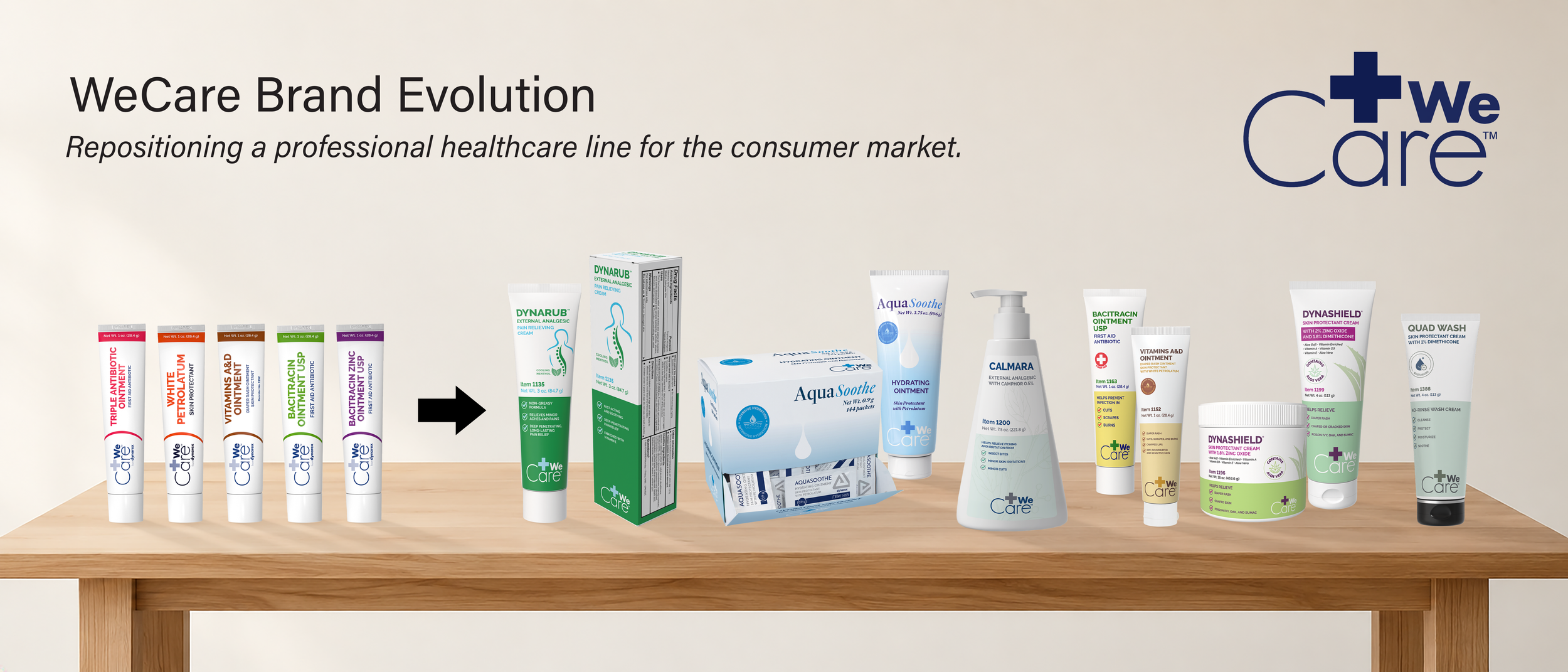
WeCare had traditionally been sold through professional healthcare channels such as nursing facilities, physician offices, and other B2B environments. The original packaging was designed for that setting and focused mainly on product identification and required information. There was little to no marketing language, benefit messaging, or consumer-focused content.
When the business began expanding the line into e-commerce and B2C, the packaging needed to do much more. Consumers would now be comparing these products directly with other brands, often online, so we had to rethink both the design and the content.
The goal was to keep the credibility of a healthcare brand while making the products easier to understand, more competitive, and more relevant to a consumer audience. That meant creating new benefit-focused messaging, stronger hierarchy, clearer visual cues, and a more approachable overall presentation.
My Role
I was managing the Graphics team, but my role on this project covered much more than design management.
I handled the project timeline, coordinated with the departments involved, and kept communication moving as the work progressed. I was essentially acting as the project manager for the packaging update in addition to leading the creative team.
I also took on the marketing research myself. Since we were moving into a very different market, I spent time looking at competing products, how they presented themselves online, what benefits they called out, and what consumers were already used to seeing within each category.
I used that research to develop the new messaging and marketing content that needed to appear on the packaging. I worked closely with Regulatory throughout the process to make sure the claims and consumer-facing content I developed were accurate, compliant, and approved before they were incorporated into the final packaging.
The Challenge
We were taking products that had been sold mainly through professional healthcare channels and putting them in front of consumers who would be comparing them directly with other brands.
That meant the packaging had to communicate faster. Someone looking at a product online needed to quickly understand what it was, what it was used for, and what made it relevant to them.
The original WeCare packaging had a strong clinical foundation, but the hierarchy was limited, and some of the important benefits were either buried or missing altogether.
Research & Marketing Direction
Before the redesign started, I researched competitors within each product family.
I wanted to understand what customers were already seeing and what felt familiar within those categories. That helped guide the way I approached messaging, icons, hierarchy, and color.
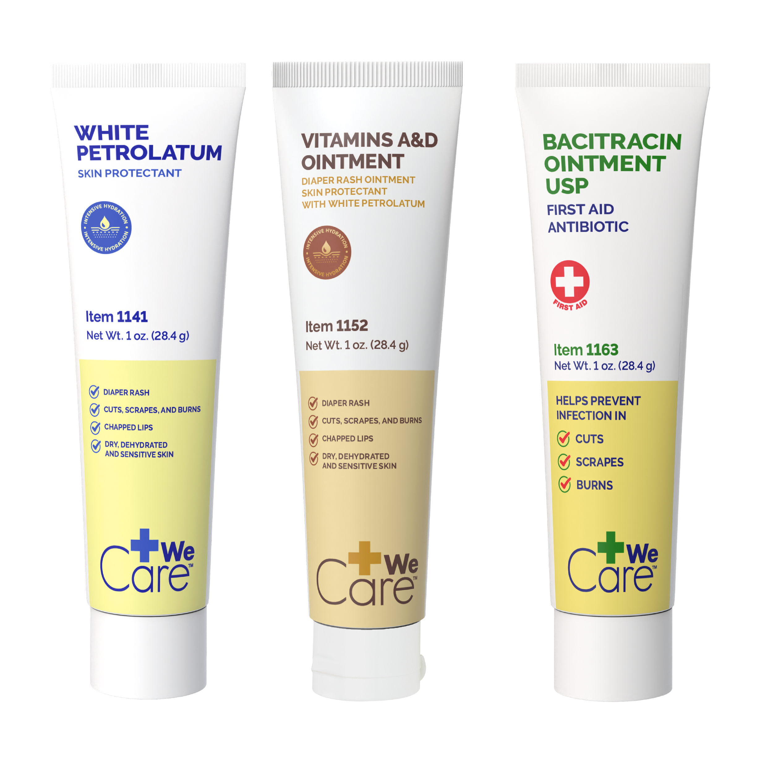
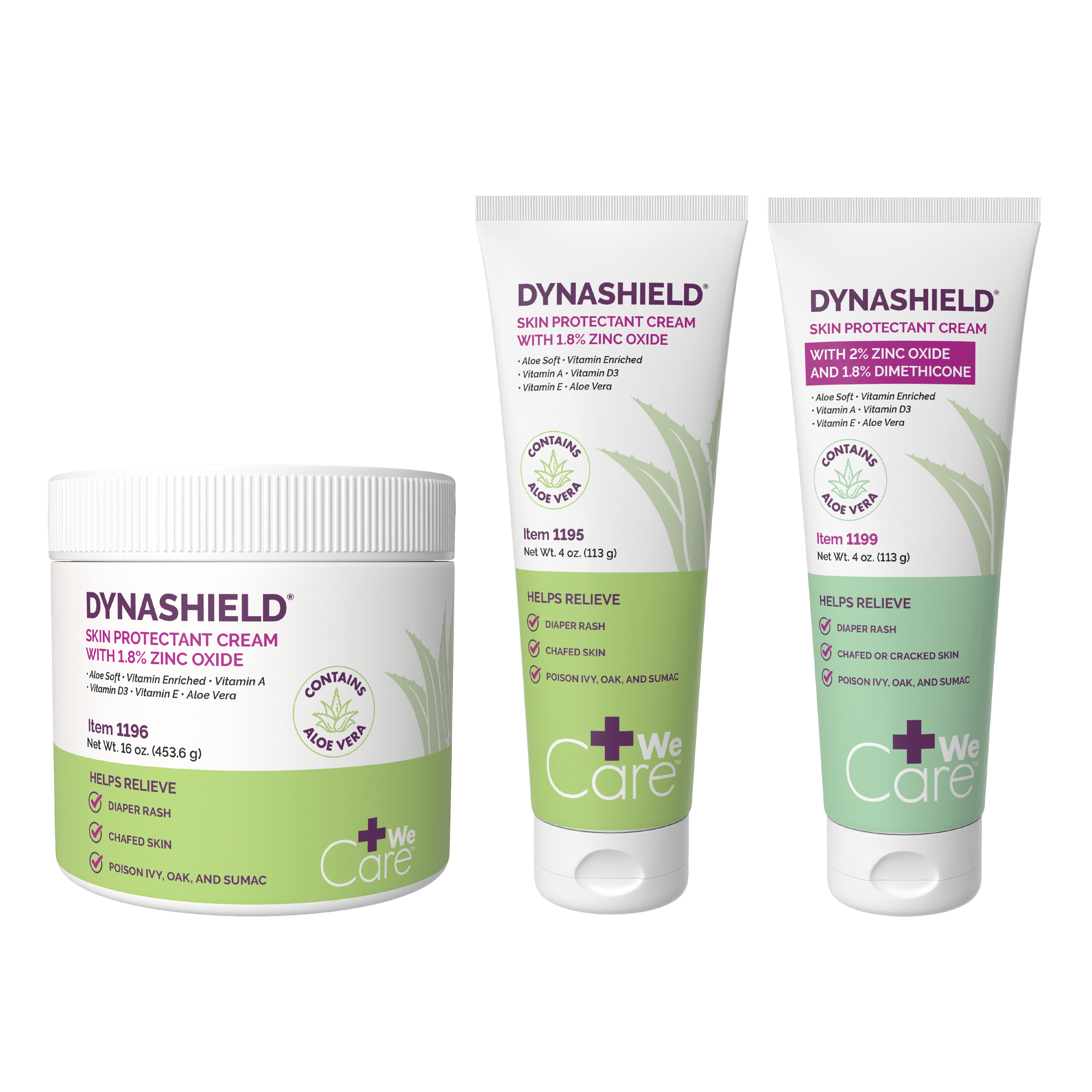
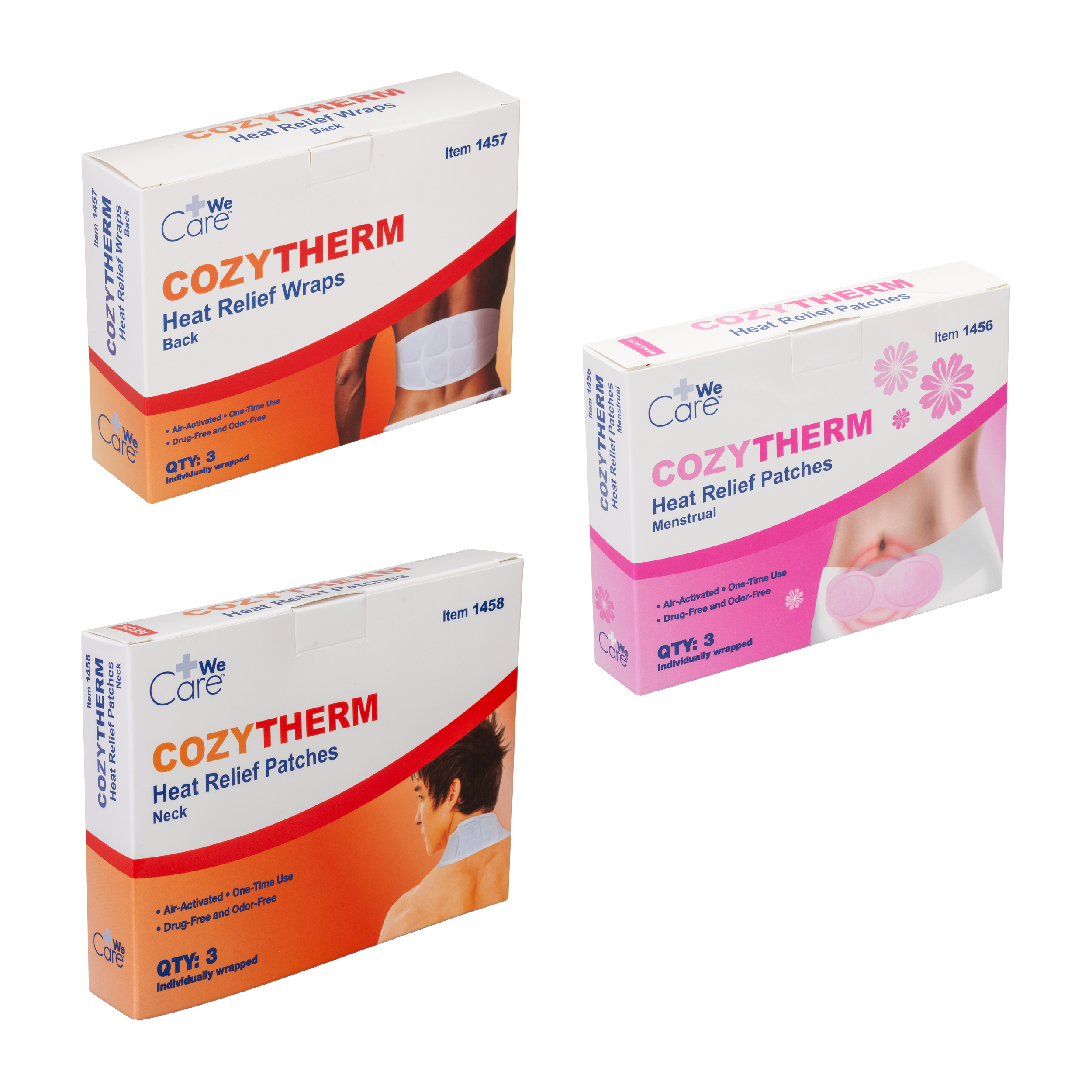
The color choices were also based on what was commonly used within each category. Using category-based color helped the products feel familiar to consumers while still keeping them connected to the WeCare brand.
Creative Collaboration
I worked with the COO and E-commerce Director, who acted as co-creative directors on the project.
I brought research, recommendations, and design feedback into those conversations. I also gave my own design input and pushed for changes when I felt something could be clearer or more consistent.
Once the direction was approved, I worked with the Graphics team to carry it through, kept the project moving, and made sure the design and messaging stayed aligned with the larger goal.
The New Direction
The updated packaging put more focus on readability and understanding.
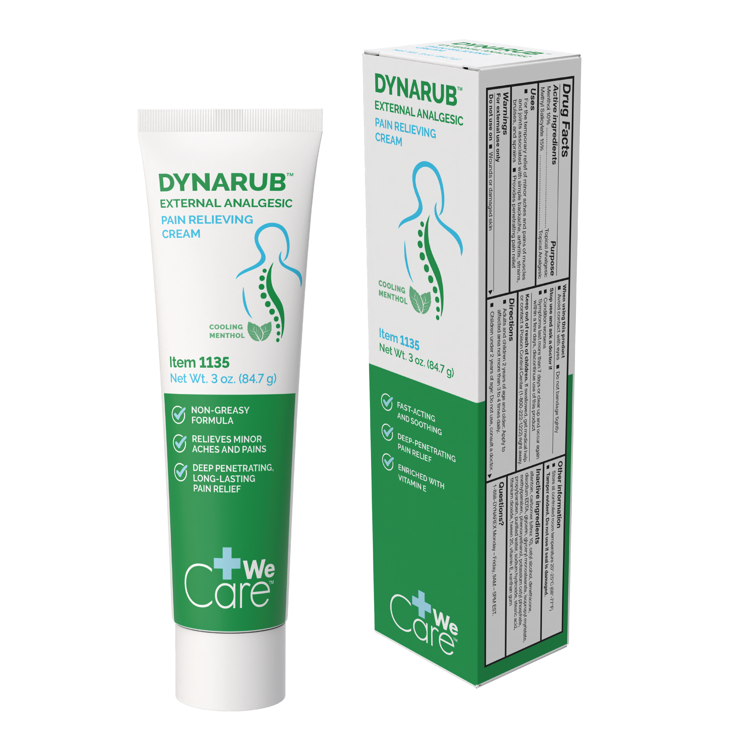
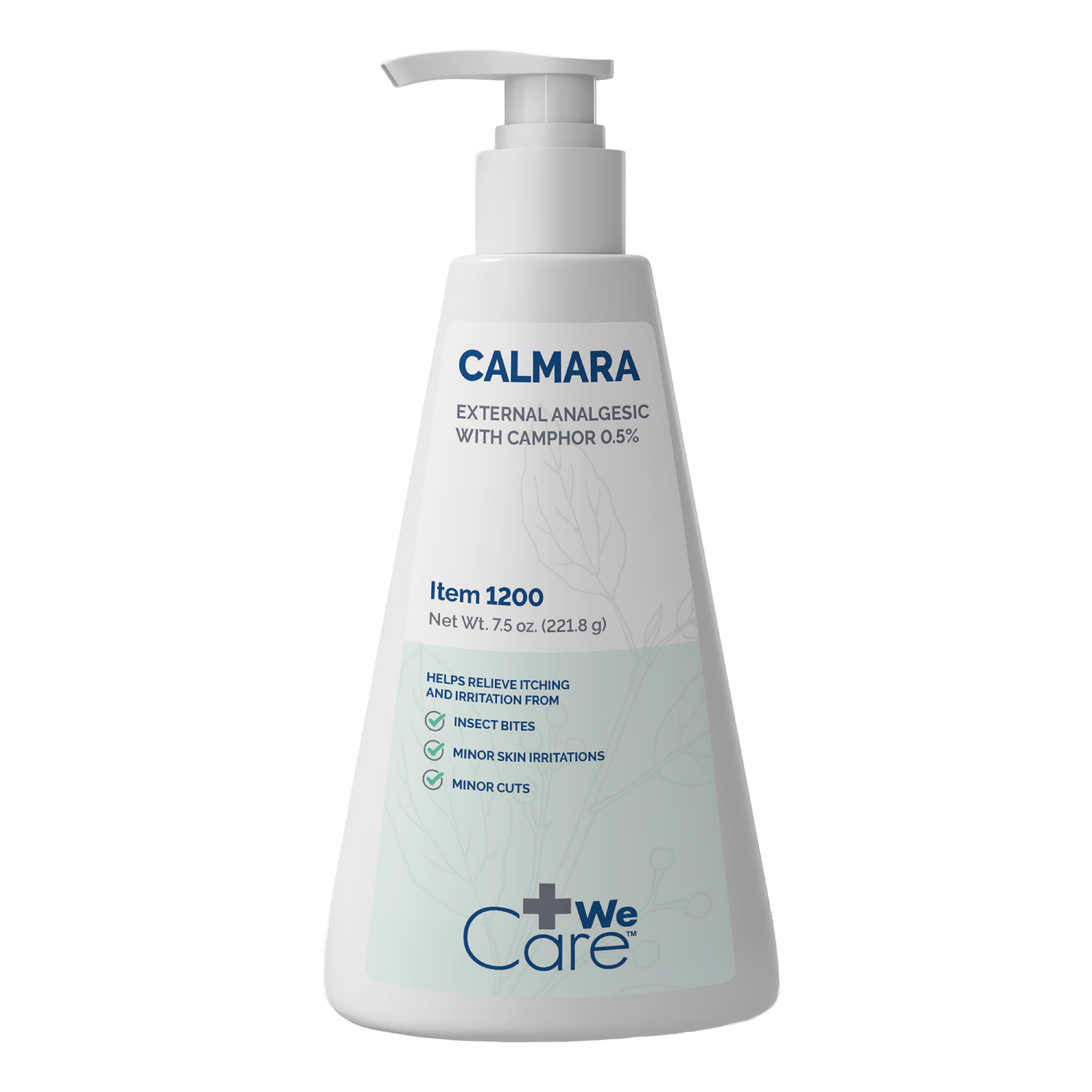
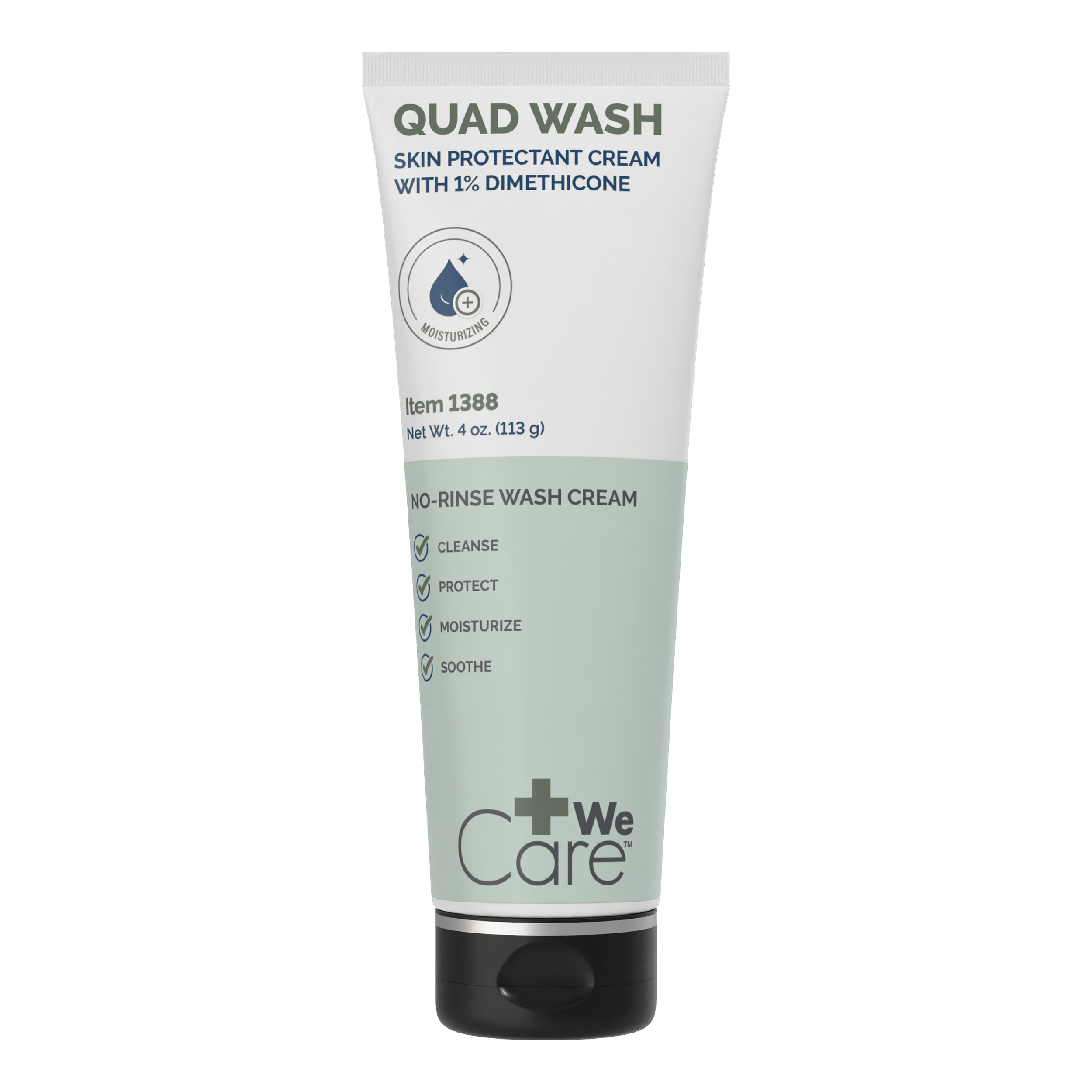
Product names and uses became more prominent. Benefit statements were shortened where possible. Icons were used to help communicate information faster, and the layouts had more breathing room.
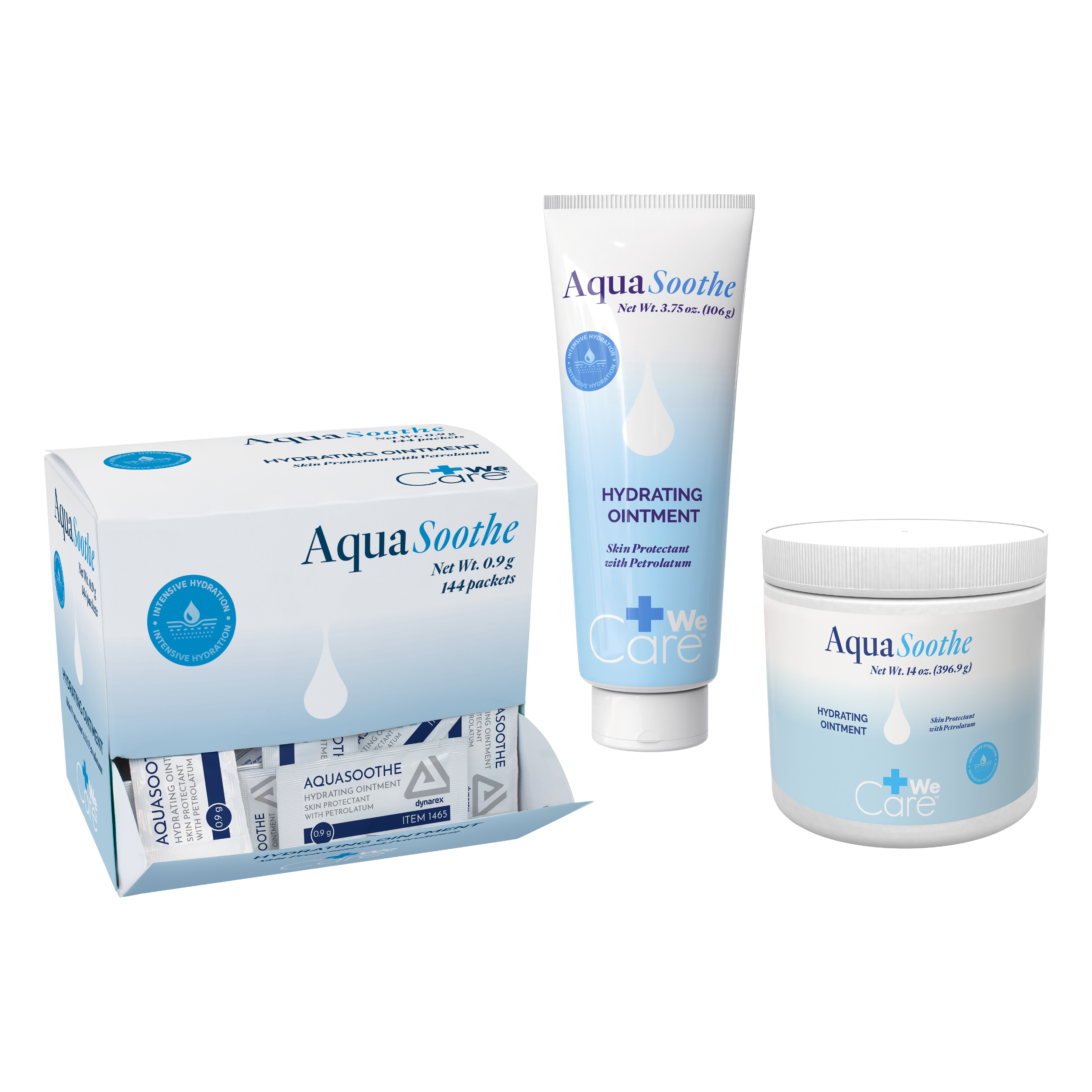
The system also had to work across a wide range of formats, including tubes, jars, cartons, and packets.
Balancing the Brand with Each Category
One of the harder parts of the project was deciding how consistent the line should feel from one category to another.
I felt the products needed a clear family connection because consistency helps build recognition and trust. At the same time, different categories needed enough flexibility to feel appropriate for their market.
The approach was to keep a familiar overall structure while allowing color, messaging, icons, and supporting graphics to change depending on the product family.
Brand Consistency and Selected Exceptions
Most of the updated WeCare line followed the same overall design system so the products would feel connected and recognizable.
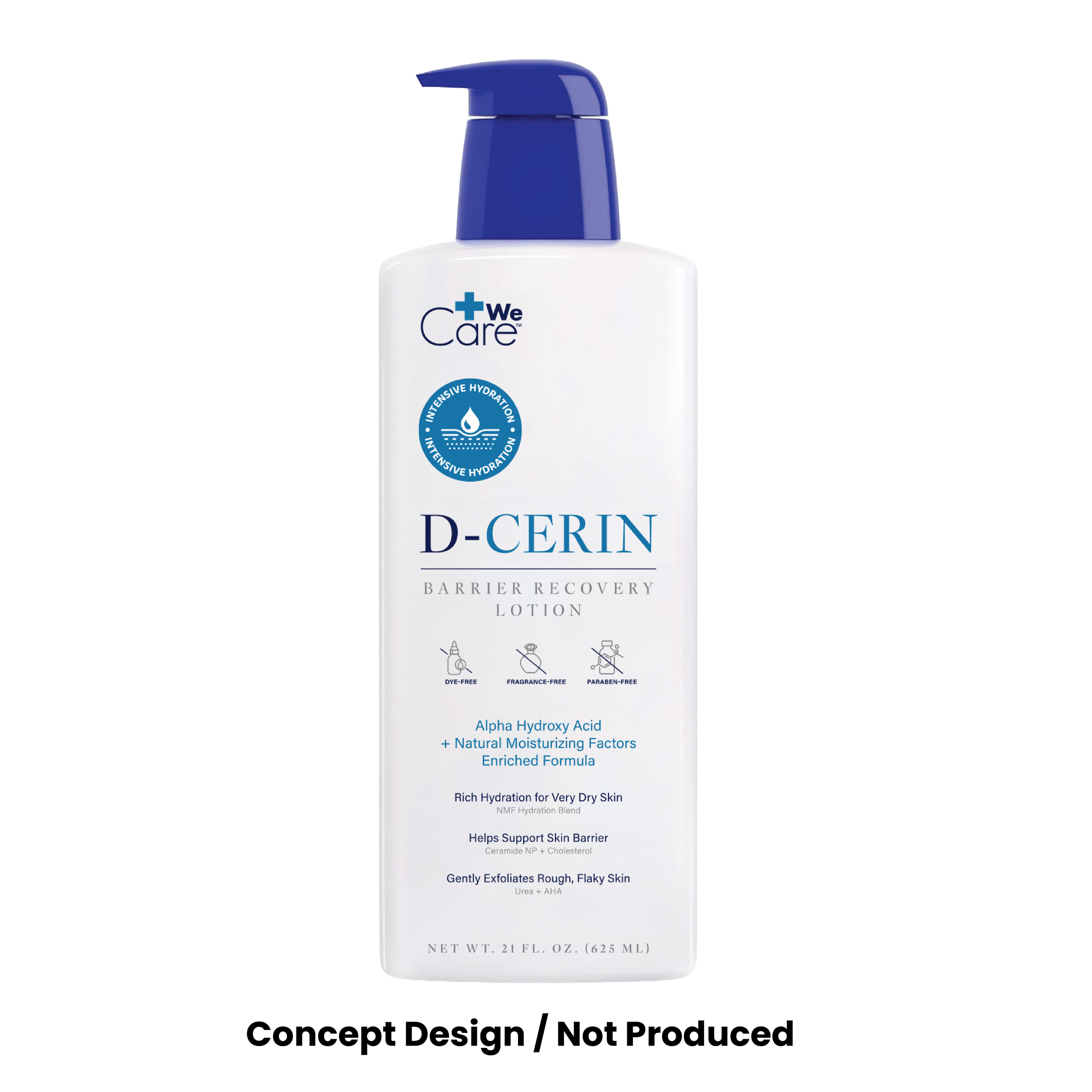
D-Cerin and AquaSoothe were exceptions. I was asked by the COO and E-Commerce Director to take these two products in a different visual direction from the rest of the line. I developed both designs to feel polished, competitive, and appropriate for their individual categories while maintaining the professional credibility of the brand.
I developed both concepts and presented the final directions for approval. AquaSoothe was approved and produced. D-Cerin remained a concept and was not brought to market. I still include D-Cerin in my portfolio because I think it is a strong design and shows another direction I explored for the brand.
The Result
The updated WeCare line felt much more appropriate for a consumer audience.
The packaging became easier to scan, the benefits were clearer, and the different product families had stronger identities while still feeling connected.
For me, this project was much bigger than a packaging refresh. I was managing the creative team, handling the project timeline, coordinating across departments, doing the market research, developing marketing content, and contributing to the design direction at the same time.
That combination of creative, marketing, and project management work is what made the project especially meaningful to me.